 Feb, 14 2026
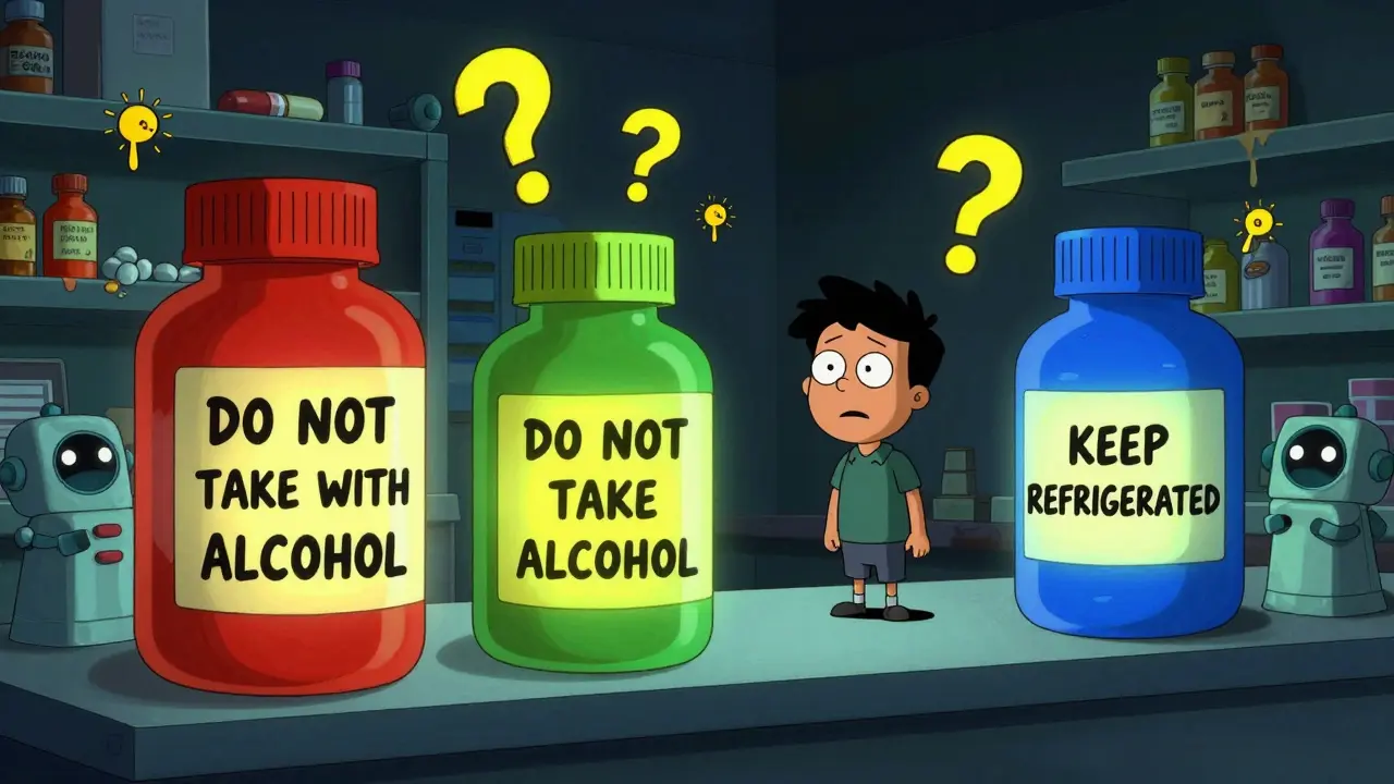
Ever opened a prescription bottle and seen a bright red, yellow, or green sticker stuck to the side? Those aren’t just decorations. They’re auxiliary labels - small but powerful tools designed to keep you safe when taking medicine. If you’ve ever forgotten how to take a pill, wondered if you should store it in the fridge, or been told not to drink alcohol with your prescription, chances are you’ve relied on one of these stickers. They’re everywhere, but most people don’t know how they work, why they’re colored the way they are, or even why some bottles have them and others don’t.
What Are Auxiliary Labels, Really?
Auxiliary labels are adhesive stickers applied to medication containers to give extra instructions that don’t fit on the main prescription label. The primary label tells you the drug name, dosage, and prescriber. The auxiliary label says things like: “Take with food,” “May cause drowsiness,” or “Keep refrigerated.” They’re not optional. In fact, research from the Journal of the American Pharmacists Association shows that 50% of patients forget verbal instructions within 48 hours. These stickers are the backup.
They’re not regulated by the FDA, but 48 out of 50 U.S. state pharmacy boards recommend their use. That’s because they work. A 2022 JAMA Internal Medicine study found that prescriptions with auxiliary labels had an 18.7% higher adherence rate for chronic conditions. That means more people take their meds correctly - and fewer end up in the emergency room.
Why the Colors? Red, Yellow, Green, Blue
The colors aren’t random. They follow an unspoken but widely used code across pharmacies in the U.S.:
- Red (used on 37% of labels) = critical warning. Think: “May Be Habit-Forming,” “Do Not Take with Alcohol,” or “Avoid Sun Exposure.” 87% of patients associate red with danger.
- Yellow (28%) = caution. This is for things like “May Cause Dizziness,” “Take on Empty Stomach,” or “Avoid Driving.” 73% of people recognize yellow as a signal to slow down.
- Green (22%) = general instruction. “Take with Food,” “Shake Well,” or “Use Within 30 Days.” 68% of patients see green as a neutral, helpful note.
- Blue (13%) = storage. This one’s simple: “Keep Refrigerated,” “Store at Room Temperature,” or “Protect from Light.” It’s critical for biologics, insulin, and some antibiotics.
A 2020 study by the American Society of Health-System Pharmacists confirmed these color associations aren’t just common - they’re deeply ingrained. Changing them confuses patients. That’s why pharmacies stick to the system, even if they don’t have a rulebook.
Where You See Them - And Where You Don’t
Not every prescription gets auxiliary labels. A 2016 University of Illinois study found that 15-25% of prescriptions lacked any auxiliary label - even when clinical guidelines said they should have one. Why? Cost, time, or inconsistent pharmacy protocols.
But here’s the kicker: the labels that are used aren’t always clear. A 2021 Johns Hopkins study found that 22% of patients misread them. For example, “Take with food” was often confused with “Take after meals.” The first means to avoid stomach upset; the second could reduce absorption. A tiny wording difference - big health impact.
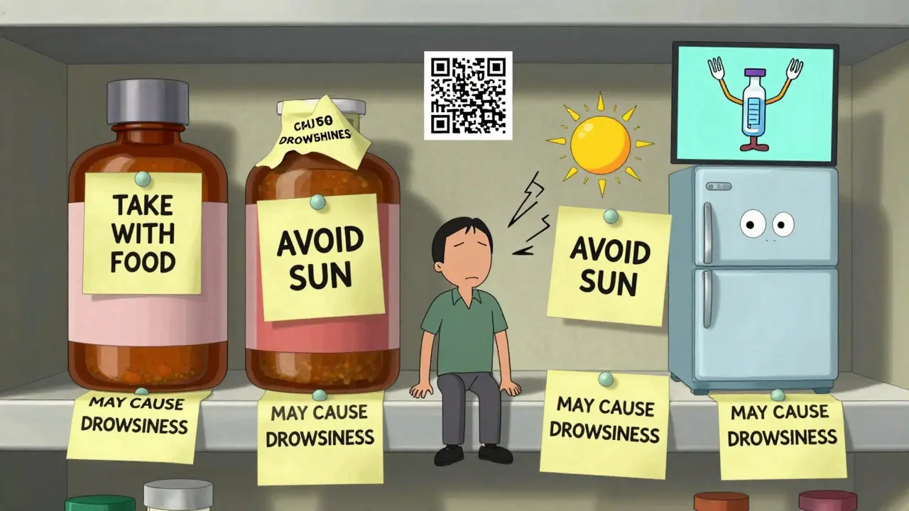
And placement matters. Most labels are stuck vertically on the side of the bottle - 82% of prescriptions, according to a 2007 University of Maryland study. But research from the University of California in 2019 showed that horizontal placement (only used in 12% of cases) improved patient comprehension by 31%. Why? It’s easier to see when you’re holding the bottle to pour pills.
Even better? Interactive placement. Some pharmacies now use labels that only become visible when you twist off the cap. That method increased noticeability by 63% in a 2020 study. It’s not common yet - but it’s coming.
More Than Words: Icons and Languages
Text alone doesn’t work for everyone. A 2018 Annals of Pharmacotherapy study found that adding simple icons - like a fork for “take with food” or a bed for “may cause drowsiness” - boosted comprehension by 47% among patients with low literacy.
And language? Only 22% of U.S. pharmacies consistently offer auxiliary labels in languages other than English. Yet 25.1% of Americans speak a language other than English at home, according to the 2022 U.S. Census. That’s a huge gap. Imagine being handed a bottle with “Take with Food” in English while your native language is Spanish - and you can’t read either.
Patients notice. A 2022 University of Michigan survey of over 2,000 people showed 83% preferred labels with both text and icons. And 67% said storage instructions should always be included - no exceptions.
What’s Next? QR Codes and Smart Labels
Pharmacies are starting to blend old and new. As of late 2023, 17% of chain pharmacies tested QR codes on labels. Scan it, and you get a short video explaining how to take the drug, what side effects to watch for, or how to store it. It’s not replacing the sticker - it’s enhancing it.
Even more advanced? Smart labels with temperature-sensitive ink. These are in pilot programs at 43 hospital pharmacies. If your insulin gets too warm, the label changes color. No more guessing whether it’s still good.
But here’s the catch: federal rules still require all medication containers to have visible, permanent safety info. That means physical labels aren’t going away anytime soon. Digital tools are supplements - not replacements.
Why This All Matters
These little stickers save lives. A 2021 Health Affairs study estimated that proper auxiliary label use prevents 127,000 emergency room visits each year - and saves $1.37 billion in healthcare costs.
They also reduce medication errors. The FDA estimates 1.3 million errors happen annually in the U.S. Many are avoidable. A clear label saying “Do Not Crush” or “Take at Bedtime” stops mistakes before they start.
Yet, implementation is messy. Some pharmacies use 5 labels per bottle. The Institute for Safe Medication Practices recommends 1-3. Too many, and patients tune them out. That’s called “label clutter.” It’s real. One pharmacist told me they once saw a bottle with eight stickers. The patient said, “I just ignore them all.”
And costs? Pre-printed rolls of 500 labels cost $8.99-$14.99. Custom ones run $19.99-$34.99. For small pharmacies, that adds up. That’s why only 38% have adopted standardized label content - even though the National Council for Prescription Drug Programs pushed for it in 2022.
What You Can Do
- Always read every sticker - even if it looks like a repeat.
- If you’re confused, ask your pharmacist. Don’t guess.
- Request pictograms or translated labels if you need them.
- Check if your pharmacy uses interactive placement - if not, ask why.
- Keep your bottle in a spot where you’ll see the label every time you use it.
These stickers are designed to protect you. But they only work if you pay attention.
Are auxiliary labels required by law?
No, auxiliary labels are not federally required by the FDA. However, 48 out of 50 U.S. state pharmacy boards strongly recommend them, and 39 states have included specific labeling rules in their pharmacy practice acts. While not mandatory, they’re considered a standard of care in most pharmacies.
Why do some pills have labels and others don’t?
It depends on the drug, the patient’s risk factors, and the pharmacy’s protocol. High-risk medications - like opioids, blood thinners, or antibiotics - almost always get labels. But for low-risk drugs, pharmacists may skip them if they believe the patient already understands the instructions. Studies show 15-25% of prescriptions lack labels even when they’re clinically recommended.
Can I remove the stickers?
Technically, yes - but you shouldn’t. Removing a label can lead to dangerous mistakes. For example, a “Keep Refrigerated” sticker might be the only reminder that your insulin will spoil if left on the counter. If a label is unclear or confusing, ask your pharmacist for clarification - don’t peel it off.
Do pharmacies use different colors in other countries?
Yes. The U.S. color system (red = warning, yellow = caution, etc.) is mostly used in North America. In Europe, Australia, and parts of Asia, color codes vary. Some use symbols instead of color. Australia, for example, relies more on standardized text and pictograms than color. Always check local guidelines if you’re traveling or using medication from another country.
What’s the most common mistake people make with auxiliary labels?
The biggest mistake is assuming the label says what they think it says. For example, “Take with food” is often mistaken as “Take after meals.” The first prevents stomach upset; the second can reduce how well the drug works. Other common errors include ignoring storage instructions (like refrigeration) or skipping labels on refills because “I’ve taken this before.” Always read every label - even on refills.

Michael Page
February 15, 2026 AT 07:31These labels are a quiet revolution in patient safety. No one talks about them, but they’re the unsung heroes of medication adherence. The color coding isn’t arbitrary-it’s behavioral psychology baked into everyday life. Red means stop. Yellow means slow down. Green means proceed with awareness. Blue means environment matters. It’s a visual language that bypasses literacy, memory, and even language barriers. And yet, we treat them like decoration.
What’s more disturbing is how often they’re omitted. A 2016 study cited here shows 1 in 5 prescriptions lack critical labels. That’s not negligence-it’s systemic underinvestment in patient communication. We spend billions on EHRs and AI diagnostics, but still rely on sticky paper to prevent death.
The real innovation isn’t QR codes or smart ink. It’s consistency. Standardized content. Mandatory use for high-risk drugs. Until then, we’re just patching a leak with duct tape and hope.
Joe Grushkin
February 15, 2026 AT 08:05Of course the colors work. Humans are trained from birth to associate red with danger. It’s Pavlovian. But let’s not pretend this is science-it’s folklore with a clinical coat. The FDA doesn’t mandate this because it doesn’t need to. Pharmacies use it because patients react to it. It’s behavioral nudging dressed up as regulation.
And don’t get me started on the ‘icons.’ A fork for ‘take with food’? That’s not helping someone with low literacy-it’s infantilizing them. If you can’t read ‘take with food,’ you shouldn’t be managing your own meds. Maybe the real problem isn’t the label-it’s the assumption that everyone should be self-managing complex pharmacology.
Virginia Kimball
February 15, 2026 AT 11:43I love how much thought goes into these little stickers! Seriously, I never realized how much work goes into making sure we don’t mess up our meds. The color system is genius-red for danger, green for ‘all good,’ blue for ‘keep cool.’ It’s like a secret language only pharmacists and patients know.
And the icons? YES. My grandma couldn’t read English but she knew the bed meant ‘sleepy time’ and the fork meant ‘eat first.’ She’d point to them like they were treasure maps. I wish every pharmacy did this. And the twist-cap ones? That’s next-level magic. I’m gonna ask my pharmacist to switch to those.
Also-please, if you’re reading this and you’ve ever peeled off a sticker? Stop. Just stop. Those things are lifesavers. I’ve seen what happens when people ignore them. It’s not pretty.
Daniel Dover
February 16, 2026 AT 03:49Consistent color coding saves lives. Simple as that.
Chiruvella Pardha Krishna
February 16, 2026 AT 11:44These labels are a Western construct. In India, we rely on pharmacists to verbally explain. Color means nothing when your primary language isn’t English and your literacy is low. The U.S. system assumes a baseline of understanding that doesn’t exist globally. Icons help, yes-but only if they’re culturally universal. A fork might mean ‘eat’ in America. In rural Bihar, it could mean ‘spoon’ or ‘tool’ or nothing at all.
And QR codes? Who scans them on a crowded bus with a shaky phone? The real solution isn’t tech. It’s training community health workers to walk door-to-door with pill organizers and visual guides in local dialects. Not stickers. People.
Kaye Alcaraz
February 18, 2026 AT 00:03Thank you for this comprehensive breakdown. The data presented here is not merely informative-it is a call to action for standardized, equitable, and accessible pharmaceutical communication. The fact that 22% of patients misread labels due to ambiguous phrasing is unacceptable. The disparity in multilingual labeling-only 22% of U.S. pharmacies offering non-English options despite 25.1% of households speaking another language-is a systemic failure.
Furthermore, the research on horizontal placement improving comprehension by 31% must be institutionalized. Pharmacy protocols must evolve beyond convenience. Patient safety cannot be secondary to cost or workflow efficiency. These are not optional enhancements-they are ethical imperatives.
Sarah Barrett
February 19, 2026 AT 21:45I’ve always found it fascinating how something so small-like a sticker on a bottle-can carry so much weight. The color system is brilliant in its simplicity. Red for danger, green for routine, blue for storage. It’s like traffic lights for your medicine cabinet.
But I’ve also seen the flip side. My aunt once took her blood thinner without reading the label because ‘it was the same as last time.’ The label said ‘avoid grapefruit.’ She didn’t see it. She didn’t know it had changed. That’s the danger of assuming. Labels aren’t just reminders-they’re insurance against habit.
I wonder if we’ve gotten too comfortable with them. Like we think they’re there to make us feel safe, not because we’re actually at risk.
Erica Banatao Darilag
February 20, 2026 AT 05:49i never thought about how the placement of the label matters but now that you mention it i totally get it. i always hold my bottles sideways to pour pills and the sticker is on the side so i have to turn it all the way around. that’s so annoying. and the twist cap ones sound amazing. i wish my pharmacy used them. also i think the icons are great. my mom is blind in one eye and she says the pictures help her more than the words. i’m gonna ask my pharmacist about getting pictograms next time.
Kapil Verma
February 22, 2026 AT 02:23India has been managing medication safety for decades without these gimmicks. We have trained pharmacists, community trust, and cultural discipline. Why are Americans so dependent on stickers and QR codes? It’s not innovation-it’s laziness. You’ve outsourced responsibility to adhesive paper. In our villages, elders teach younger generations how to take medicine. No color codes. No icons. Just knowledge passed down.
This whole system is a symptom of a broken healthcare culture. You treat patients like children and then wonder why they don’t follow instructions. Fix the system, not the label.
Mandeep Singh
February 23, 2026 AT 10:05Let me tell you something about these labels. I’ve worked in 12 different pharmacies across three states. I’ve seen patients ignore them. I’ve seen them peel them off. I’ve seen them throw the bottle away because the label said ‘may cause drowsiness’ and they thought it meant ‘don’t take it.’
The truth? These stickers are not the problem. The problem is that pharmacies are understaffed, overworked, and underfunded. We print 500 labels a day. We don’t have time to explain each one. We don’t have time to ask if the patient understands. We don’t have time to switch to horizontal placement. We don’t have time to offer Hindi or Spanish labels. We do what we can with what we’re given.
So stop blaming the sticker. Blame the system that lets pharmacists work 12-hour shifts with no support. Blame the insurance companies that won’t pay for training. Blame the politicians who cut funding to public health. The label is the least of our problems.
And before you say ‘just ask your pharmacist’-try showing up at 7 a.m. on a Tuesday when there are 14 people in line and you’re the third pharmacist on duty. Tell me how ‘asking’ works then.
These stickers? They’re a bandage. We need a surgery.